SYAFIQ K. DESIGNS
Revamping FEO's new website
Methods: Feature Inventory & Prioritisation, Wireframing, Prototyping & Testing, UI Specifications & Documentation
Tools: Adobe XD, Photoshop
Type: Client Project
Timeline: 2 months

Challenge:
To position Far East Organization’s new website as a more user-friendly site(compared to their previous site); aligning with their new corporate identity and in comparison with their competitors.
Role:
I was tasked to perform the Content, Competitor Analysis and Feature Prioritisation and on to follow up with executing wireframes and prototyping for both mobile and desktop. My other teammates had already worked on the research of the business and defining the target audience prior to me getting on board with the project.
1
2
3
4
5
Discover
Define
Develop
Design
Next
Steps

Understanding FEO's business and their goals:
Far East Organization(FEO) is a Christian Enterprise that develops real estate and operates businesses by serving with Grace, Love, Integrity and Honesty.
FEO is currently in the midst of a Corporate rebrand exercise and are looking to revamp their website to something more modern looking. We have the chance to make the website more appealing to users and encourage interactivity within the pages. It is an opportunity to incorporate new elements (videos, banners) to the website making the brand seem more exciting and unrestrictive.
Due to budget and time constraints, the client has already ironed out the elements and layout that they wanted with their in-house design team. Our job was to provide functional and aesthetic suggestions, based on the UX process, to their initial concept.
Content Analysis:
We did a content analysis of the 'About Us' page of the existing site(which was the page that we focused on), to examine the overall content and some problems we identified were:


Mobile-first:
We proposed our client to have the website designed mobile-first; a decision made due to the fact that the majority of their users (based on user research) primarily browse their website via their mobile.
1
2
3
4
5
Discover
Define
Develop
Design
Next
Steps
Persona:
We have identified 4 personas, however for the purpose of this case study we decided to highlight the main key persona:
'Home Buyer Albert' based on the analysis. Albert is 35 years old, an affluent individual and the solebread winner of the family who is looking to buy a new home. Below are the scenario, goal, needs and frustrations of Albert; as well as the problem & solution statement.

Albert, 35, Business Owner, Singapore
"I want to live not just in a home, but one which can also enhance my family's life."
Goals:
• Discover interesting and uniquely designed
areas for living
• Learn more about how the area he's living in can bring value-add to him and his family
• Needs some form of credibility and trust in the property development's business
Frustrations:
• Does not like text-heavy websites
(prefers visuals)
• Finds some websites navigation too confusing
Problem:
Albert wants to look for a uniquely designed home that allows him and his family to learn more about the area they will be living in and what it has to offer so that it can benefit their lives in the long run.
Solution:
We believe by redesigning the website and focusing on improving the navigation, user flow, visuals and information on the site, we will meet Albert’s goals and frustrations.
How Might We:
-
Highlight the enterprise's credibility and portfolio on the page?
-
Improve the information and visuals presented on the website?
-
Create a seamless navigation for the users?
1
2
3
4
5
Discover
Define
Develop
Design
Next
Steps
Prioritising the features:
Next we mapped out what features need to be added in the Must, Should, Could, Won't columns based on how much it would impact the business and customers.
Must
Should
Could
Won't
-
Highlight the who, what, when, why how of FEO's business
-
Seamless user flow and navigation for users
-
Include the relevant corporate images and information
-
Use plain language and reduce the amount of text used
-
Propose fresh interactions/design layout that could make the website look exciting and interesting
-
Change the content of the other pages
-
Change the branding identity
Site Map:
Based on our Persona's needs, as well as business goal considerations from FEO, we proposed the site map for the 'About Us' page:

1
2
3
4
5
Discover
Define
Develop
Design
Next
Steps
Mobile Wireframe Iterations:
We came up with the 1st version of the mobile wireframe after getting the green light from the client. After a few discussions with the client and getting some feedback internally from a group participants (about 5-8 people), here are some of the key changes:


1. Hero Banner:
The feedback we got from our client and participants were that the landing page was not captivating or 'fresh' enough. We decided to propose another design that allows users to click 'discover more' to read about each of their brand pillars.
As for the navigation bar, the client has specified that they would prefer it on the right and the search function to be hidden in the hamburger menu.
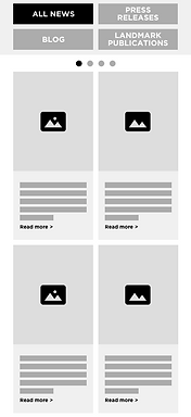
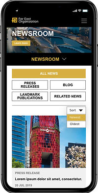
2. Newsroom Page:
We decided to change the layout of the newsroom page since majority of the feedback mentioned that it would be rather impossible to read the narrow article thumbnail boxes.
The client also mentioned that they would want to users to view the latest and oldest news, followed by the number of pages that are available.


3. Who We Are Page:
Most of the participants were unsure of what to expect of the 'Our Core Values' section, so we proposed from side scrolling to a folder-like tab function.
As for 'Milestones' section, we also proposed for the main decade to be centralised in the timeline and for the next subsequent decade to be slightly faded out, prompting users that there could be more to read by clicking the right arrow or swiping left.
From Mobile Wireframes to Mocks:
After finalising the wireframes, we proceeded to create high-fidelity prototypes to test if the functionality and navigation works as intended.
The challenges we had were with some of the corporate images; the sizes and dimensions were not as ideal for the layout and design. In retrospect, perhaps a mid-fi version might have been better to start off rather than the lo-fi wireframes, as the earlier we could identify these obstacles the easier it is to rectify the issue.


From Mobile to Desktop:
Moving from mobile to desktop was not so much of a challenge; since the desktop has a larger screen size to work wit, it allows for minor layout tweaks and readjustments out from the mobile version. We still decided to go with a lo-fi wireframes first, as we wanted to test and confirm the functionality and navigation, before moving on to the hi-fi mockups (shown below):
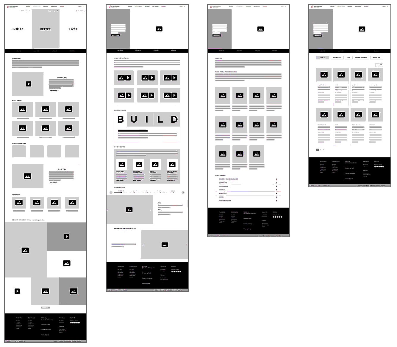
Post-production:
Additional materials that were delivered to the client and their development team were files that indicated the UI specifications of the mobile and desktop design. Ensuring that the development team got the spacing, dimensions, sizes of the boxes/images and font usage/sizes right and consistent to what was designed. Some of the examples are shown below:


1
2
3
4
5
Discover
Define
Develop
Design
Next
Steps


Next Steps:
-
Due to time constraints, there was not sufficient time to conduct adequate testings for the design. Thus for the next phase, we would like to propose additional testings such as Tree Testing, Usability Testing and System Usability Scale to further refine the overall navigation and functionality.
-
Additional unique interactions could also be added to give the design a added modern and fresh vibe. This however have to be proposed again to the client as it was not part of the initial discussion.