SYAFIQ K. DESIGNS
The unique ACM experience
Methods: User Interviews, Affinity Mapping, Feature Inventory & Prioritisation, Wireframing, Prototyping & Testing
Tools: Figma, Photoshop
Type: Course Project
Timeline: 16 days

Overview:
ACM is in the midst of a transformation to meet the changing demands of users, and are looking to redesign their museum service experience at the physical space and digital touchpoints to increase visitor traffic and customer satisfaction. The SEJ Curators came up with a detailed plan to improve the experience of our users and client: from empathising with our users, defining our target audience and their needs and problems, studying our competitors and identifying opportunities to coming up with a solution and validating them with prototyping and testings.
Role:
Everyone in the team was involved in the user interviews, user testings and analysis portions. My major role was focusing on the wireframes and UI design, while at the same time overseeing the art direction of the entire project.
1
2
3
4
5
User
Research
Competitor
Analysis
Design
Concept
Prototyping
& Testing
Next
Steps
Online Research:
One of the first few pieces of information we got online was that ACM used to have a visitor app in the past for special exhibitions. We also learnt that the app had some problems due to the weak wifi reception and bandwidth issues. After that, we did online research to understand an overview of what ACM provides and what visitors say about the museum:
Like the fine collections
and explanations
of exhibits
+
Feel that the museum
is boring and lacks
a narrative
-
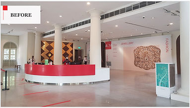
Service Safari:
From our online research, we then decided to do our own service safari to empathise with the users, explore different touchpoints and understand internal processes whilst identifying opportunities & pain-points:
-
Offer an immersive & cultural experience through performers / knowledgeable guides
-
Use technology or messaging to enforce compliance (instead of security staff
-
Consistent & prominent signage to direct user flow
-
Visual sprucing of gallery’s walls/floors/ceiling with floor markers to inform users where they are at
-
Use audio/music to support learning
User Interview:
The next step was to gathering insights through in-depth 1-1 interviews with 12 users (male & female, ages 20-40, locals & foreigners) to understand the motivations and goals of going to museums, gather insights on behaviours & feelings at a museum and identify key touchpoints and pain points in the museum experience. These were the key findings from our affinty mapping from the interviews:
Association & Motivations:
Why users visit museums and what
do they associate museums with
Awareness & Planning:
How users find out about museums
& how they plan for their trip
Museum Experience:
What users look for and are frustrated by when they visit the museum
Persona:
From the affinity mapping, we created a persona to understand their goals and frustrations:

Lana, 31, Business Consultant, Singapore
"I love visiting museums that have great stories and interactive elements!"
Goals:
• Discover unique museum experiences
• Great storytelling in exhibits and docents
• Learn something new and inspiring by
stepping into the shoes of those in the past
Frustrations:
• Content in the museum is boring or static
• Unable to understand what she’s looking at
• Would not want to miss the exhibitions during
her time in the museum
From there, we crafted the problem and solution statement.
Problem:
Lana wants a museum experience that has great storytelling and educational content so that she can learn about new things and enjoy her time there
Proposed solution:
We believe that by having more interactive features within the museum (via physical and digital forms), we will meet her needs and improve her overall museum experience
Next, we look at the customer journey map; we would like to highlight the 3 points of on the bottom right hand portion of the image, which influences our design concept next.

1
2
3
4
5
User
Research
Competitor
Analysis
Design
Concept
Prototyping
& Testing
Next
Steps
Feature Inventory:
We compared with 5 other museums, to identify the features that ACM was possibly lacking and from that, discover any possible opportunities.

We decided to focus solely with National Singapore Museum, due to it being a direct competitor with ACM and having the most features for us to study from, and the opportunities we discovered were to:
-
Supplement learning through bite-sized facts and visual displays
-
Highlight Asian culture & way of life through decor, ambient music, religious worship and cultural products
-
Have available docents/guides on the spot to give hourly sharings on galleries in the museum
In short, here are some of the museums' best practices that we can learn from:

Docents available around exhibits to share stories & take questions
.png)
Gallery decor to the theme of the exhibit, to provide an immersive experience
.png)
Large visual displays to convey the story better through visuals & motion

Digital guide that recommends exhibits based on your interests, & pushes alerts to phone
1
2
3
4
5
User
Research
Competitor
Analysis
Design
Concept
Prototyping
& Testing
Next
Steps
Objective:
Improve the learning experience for ACM visitors through an immersive walk-through experience in physical space of the museum and supported with bite-sized information on the app.
Physical Space Feature Prioritisation:
Below are the features we have decided to focus on for our physical space.
Must
Should
Could
Won't
-
Prominent gallery signage and info panels
-
Storytelling using digital technology
-
Storytelling using corridors and walls to place printed or painted artworks, replicas, murals, etc.
-
Gallery decor to bring atmosphere
-
Relaxing ambient sounds, carefully picked to align with the theme of the gallery
-
Increase availability and visibility of Docents & Guides
-
Hands-on activities & workshops
-
Redesign / shift the layout of the exhibits
-
Write the content copy on the information displays
Prominent gallery signages/info panels & storytelling using digital technology:


Storytelling on walls:


Enhancing Gallery Decor:
.jpg)
.jpg)
Docents & Guides:

.jpg)
Digital Space Feature Prioritisation:
For our digital space, we introduced a museum app mobile device + headphones - we want users to experience the audio separately for specific exhibits and conserve their mobile phone batteries as well as solve the wifi and bandwidth issues we learnt from the previous app.
Must
Should
Could
Won't
-
Bite-sized info/fun facts
-
A clickable map that tracks your location in the museum
-
Audio guide comes from app
-
Bookmarking resources/exhibits I’m interested in
-
Quiz & activities that nudge users to inspect / learn more about exhibit
-
Collect email / contact information for lead generation
-
App interface incorporates a dark mode, to reduce eye strain and match the museum ambience
-
Have users download it as an app on their mobile phone (like ACM's predecessor app)
User Flow:
Here is an overview of the user flow - users enter the museum and collect the mobile device. Whilst navigating and exploring the museum using the map feature, users can also find more info on the galleries/exhibits via the exhibit code search. They also have the option to send bookmarks/resources to their email or mobile phone.

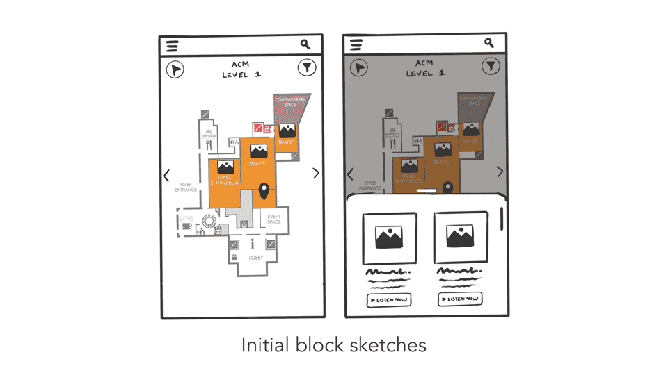
From sketches to wireframes:
We started with block sketches stemming from the idea of users navigating through the museum and went straight into a mid-fi prototype - to ensure that the digital and physical space ambience matches before moving on to the usability testing.
1
2
3
4
5
User
Research
Competitor
Analysis
Design
Concept
Prototyping
& Testing
Next
Steps
Objective:
Simulate an end-to-end experience of visiting the museum with a supporting digital guide, using a click-flow prototype built on mid-hi fidelity mock-ups. We explored a flow that allows users to go back and forth from a physical space to the digital guide, to bring the most of the simulation and to observe their experiences.


Final Prototype
Walkthrough
Usability Test Findings:
We did 3 rounds of testing, 5 participants for each round; a total of 15 testers. We gathered both quantitative and qualitative data. Below is a summary of the test result - the bars represent the rounds and the numbers at the top represent the average ratings (ease of use: 1 being the hardest, 7 being the easiest) given by testers for each round.

Key findings:
-
Consistent passing of tasks with testers until the last round of testing
-
% drop for 3rd task; 3 testers were unsure what to do with the ‘search exhibit code’ function
-
% drop in 4th task, despite no changes made to the design since version 1 (1 tester would rather focus on the exhibits than use the app)
Remarks:
-
Qualitative data shows the reasons why user(s) rate high or low
-
We will address (in the next section) what changes were made for the iterations and how we decide to resolve the drop in the ratings for the last round
Navigation of device:
This particular page, even after the first iteration, proved to be confusing to the testers due to them not knowing whether the page corresponds to just the statue in the page or the gallery itself. Below are the iterations and results.

Results:
-
[v.2&3] There was no more confusion about the gallery vs exhibits
-
However, 3 of 10 users did not understand the significance of the statues featured
Version 4 changes:
-
Replace the image of statues with a generic image of the gallery
Gallery exhibits:
We observed that testers had problems with the exhibit code button, a key feature of the app. We decided to change it to the brand colour to make it more prominent. The audio button has also been replaced to allow users to pause or scrub. The icon of the app has been changed to the same one used for the exhibit code, and we also added it to the welcome page to give familiarity to users before the home page screen.

Result
-
[v.3] All 5 users noticed the “exhibit code” button
-
[v.3] However, 3 of 5 users failed the task to enter the exhibit code on the app
Version 4 Changes:
-
Replace app icon with exhibit code icon and include an onboarding page on how to use the exhibit code
-
Make the exhibit code more prominent on the physical display
Signage & Welcome:
Testers had no idea if it was a device to be collected at the info desk for the version 1. We changed the image and copy to inform users better that it is a device from the museum and not something that they have to download on their mobile phone.

Result
-
[v.2&3] Only 1 of 10 users enquired about the guide and whether it was an app to be downloaded, while 9 of 10 users knew to go to the front desk to collect the device
1
2
3
4
5
User
Research
Competitor
Analysis
Design
Concept
Prototyping
& Testing
Next
Steps
Test Limitations:
We discovered there a few limitations, such as:
-
Unable to see how users move in the physical space due to the non-familiarity with click-through prototypes
-
Unable to test the effect of the gallery decor against the lighting and physical space
-
Tasks for the tests are harder as users cannot experience the app & physical space at the same time (e.g. exhibit code)
-
Unable to test the staff’s explanation of the app and how they interact with users
-
Difficult to assess the feasibility of proposed features due to unknown budget and cost considerations
Refine Prototype & Usability Test:
We would also like to further improve the user experience in the future by:
-
Testing at ACM and use the mobile device to explore physical movements and interaction with the app
-
Involving ACM’s Visitor Service Officer as part of the usability tests to explain and provide the app
-
Engaging stakeholders to understand budget constraints and prior learnings on the old mobile app
-
Prioritising features based on new COVID-19 safe-distancing measures
-
Including the frames for the map’s filter options, GPS tracker and street view of the map
Improve ACM's corporate website:
Lastly, we would want to improve ACM's website by considering:
-
The items on the navigation menu, which are currently vague-sounding and confusing
-
The long page scroll to find key information (e.g. opening hours, costs, location)
-
The lack of visually engaging content to attract attention
Other opportunities we have also thought about are:
-
Improve the site’s information architecture and labels on the navigation bar using a card sorting and tree-testing exercise
-
Include video tour experience of exploring the museum and using the digital guide
-
Upload a 1 pg downloadable flyer that displays key info about the museum (i.e opening hours, location, exhibits, cost)