SYAFIQ K. DESIGNS
Johnson's Pet Shoppe
Methods: User Interviews, Affinity Mapping, Feature Inventory & Prioritisation, Wireframing, Prototyping & Testing
Tools: Figma
Type: Course Project
Timeline: 2 weeks

Challenge:
Designing a new eCommerce website for our client, Johnson's Pet Shoppe. Considering the client's brief at hand, which is focusing on customer service, reasonable pricing and keeping it local, we wanted to gather some broad-level information on how we can position the brand in the market. As well as understand if there were any potential opportunities out there for the brand to focus on.
1
2
3
4
5
User
Research
Competitor
Analysis
Site Map
& User Flow
Prototyping
& Testing
Next
Steps
User Interview:
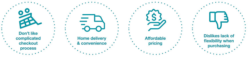
We interviewed 8 pet owners (male & female, ages 20-40 years old) and asked about their behaviours and motivational factors for purchasing pet supplies online. These were the 3 key findings what we discovered based on our analysis from our affinity mapping
Persona:
Based on the analysis, a persona was created. Izzy is an animal lover and owns 2 cats. She buys her pet supplies bimonthly online as she is too busy to purchase them in stores. She feels by purchasing or sorting her pet supplies online, she can focus on other things, such as spending more time with her cats. She also always checks various online pet stores to find the best prices or promotions available.

Izzy, 30, Sales Manager, Singapore
"I would usually browse several sites and look for the best prices.
I also really like the promotions and free delivery as I buy in bulk!"
Goals:
• Wants affordable prices for her pet supplies
• Needs a reliable and fast delivery
Frustrations:
-
Does not like complicated account signing up or checkout processes
-
Does not like lack of flexibility/options when purchasing products online
From the Persona, we came up with the problem & solution statements as well as 'How Might We' tackle the problem with the proposed solution
in mind.
Problem:
Izzy needs a website that offers
affordable pet supplies and reliable
delivery so that she can save her expenses and get her items on time.
Proposed solution:
We believe by having an online store that has reasonable pricing and efficient home delivery for pet owners, we will meet our customers needs and increase online purchases.
How Might We:
• Highlight promotions on our website?
• Communicate our reliable and fast home delivery to our users?
• Create a seamless checkout process for our users?
1
2
3
4
5
User
Research
Competitor
Analysis
Site Map
& User Flow
Prototyping
& Testing
Next
Steps
Feature Inventory:
We looked at 4 other local online pet stores and mapped out the features that were available from each website. This also allows us to align with our persona's goals and needs to propose our website's feature prioritisation.

Zeroing in on Perromart
From the 4 competitors, Perromart seems to be the most consistent in terms of the features available. What was interesting was that it was the only website we found that has the most number of reviews and ratings from customers.
We discovered that this was due to the fact that they provided an incentive (via a point system) to their customers for completing a review or rating. This is an area we could focus on to bring additional business value to Johnson's Pet Shoppe.

Feature Prioritisation:
We looked at the feature prioritisation (below) that was presented to us in the brief and see if we could align it with our persona's needs and the competitor analysis. This helped us articulate the features we would want in the wireframes and how the site map/user flow might look like.
Must
Should
Could
-
Have multiple clear ways of locating specific products
-
Each product must have a product description page
-
Have an efficient way of purchasing one or more products
-
Steer customers toward popular products
-
Allow customers to contact the business
-
Allow customers to browse products related to their current selection
-
Allow customers to read and write reviews of a product
-
Provide information about the store
-
Allow customers to shop by major brands
-
Allow for multiple images per product
-
Adapt the experience appropriately across desktop and mobile
-
Reward loyalty for repeat customers
1
2
3
4
5
User
Research
Competitor
Analysis
Site Map
& User Flow
Prototyping
& Testing
Next
Steps
Site Map:
By using card sorting method from 5 participants, and the user interviews in mind, we were able to derive the categories and structure the sitemap navigation.

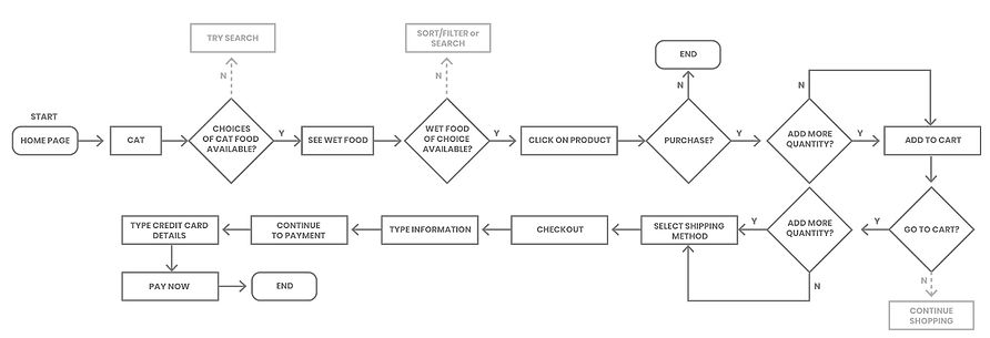
User Flow:
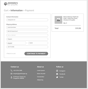
Presented here is the proposed user flow for product discovery and checkout process. It highlights how the user would search for particular cat food, view more information on the product and how they would proceed to purchase the item.
1
2
3
4
5
User
Research
Competitor
Analysis
Site Map
& User Flow
Prototyping
& Testing
Next
Steps
Initial Wireframes:
Below are some of the initial wireframes that were created after looking at the feature prioritisation and site map/user flow. These were then prototyped for the first usability testing round.

Home
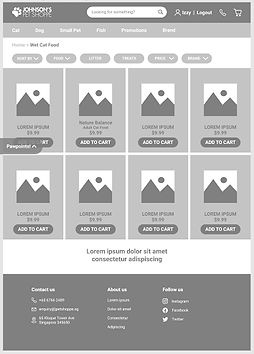
Product List
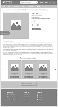
Product Detail
Shopping Cart
Checkout
Usability Testing (UT) Objective:
We did 3 rounds of testing, 3 participants for each round; a total of 9 testers. They were also given 3 tasks to perform and qualitative data was gathered after the test to understand what could be improved from the tester's perspective (due to all the participants passing all the tasks).
Key Findings:
Below are the summarised feedback on what went well and what could be improved. We will present how we decide to address the issues with the iterations later on.
-
Likes the reminder of amount needed to hit the FREE delivery
-
Likes the recommended products section in product page
-
Noticed the ‘add these items to your cart to get FREE delivery’ immediately after colour was added
-
Will definitely use the above-mentioned feature to add items to their carts to get FREE delivery
+
-
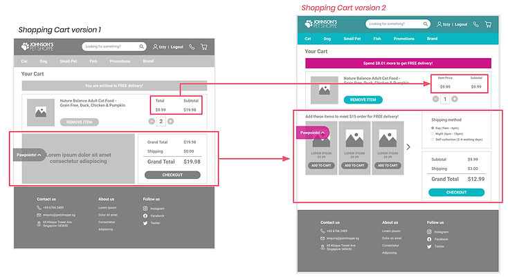
The total and subtotal wordings were confusing
-
Would like to have delivery timing options
-
Feels product page is too long (did not know there is more info below)
-
Testers would like to see more product images.
-
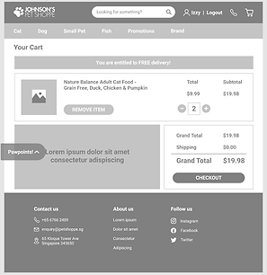
Shopping Cart Page:
Initially confusing to testers, the copy for the item price and subtotal were reflected properly based on industry standards. Also added a shipping method option and recommended products for users to hit the minimum amount for free delivery. Testers were satisfied with these new features added during the next rounds of testing.
Product Detail Page:
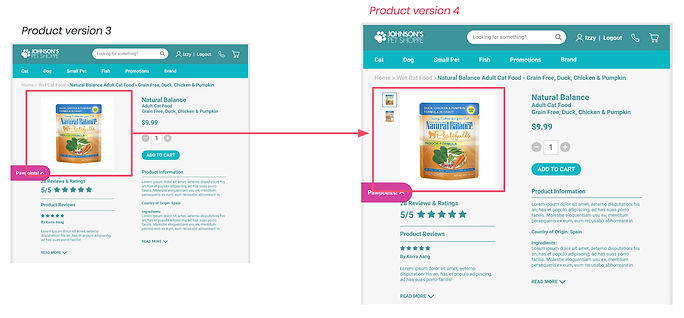
Most of the testers found the product detail page initially too long. They felt the image was too large and that they would miss key information such as product info, country of origin, ingredients, etc. from version 2. They also wanted to view more of the reviews and ratings from other customers.
We scaled the image to be smaller so there would be more space to lay out the copy on the side, and also added a more detailed description of the product so users would know what to look out for; at the same time a review and ratings section that is visibly just below the product image.
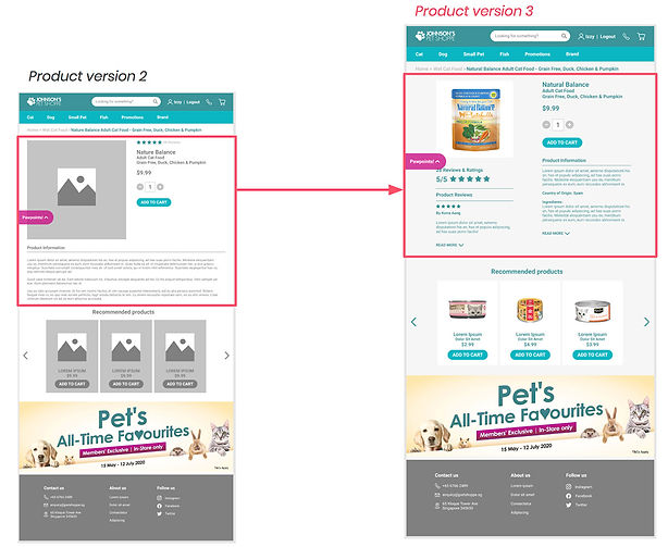
Multiple Product Images:
After the final round of testing with the hi-fi prototype, majority of the testers mentioned that they would like to see multiple product images, such as the back of the product, so they could read all the information and match the text on the website itself. We added thumbnails at the side to include both the front and back view of the product. They could also auto-zoom into the image to have a clearer view.

Johnson's Pet Shoppe
Final Prototype
1
2
3
4
5
User
Research
Competitor
Analysis
Site Map
& User Flow
Prototyping
& Testing
Next
Steps
Improving Customer Service:
The next steps we would like to prioritise would be the store's rewards system, which we were unfortunately not able to expand on due to time constraints. We would definitely take into consideration how customers reviewing and ratings the products would/could get rewarded, just like how Perromart did theirs.